How the National Park Service is Forecasting Color Trends
- Written by
- On Sunday, October 25, 2020
Trends have many different origins, but we must say, we never expected the latest interior trends to come from the National Park Service (NPS), but we couldn’t be happier about it. The NPS recently started the hashtag #NPSColorForecasting and posted beautiful scenes from national parks, like Glacier and Yellowstone, accompanied by coordinating color swatches.
This trend couldn’t come at a better time given that most of us are reeling from this year and could seriously benefit from some gorgeous, nature-infused hues in our homes.
The Grand Canyon got into the action with this striking shot featuring rich, dusky hues that would bring warmth to any aesthetic.
Joining the rest of our fashionable colleagues on the runway, Grand Canyon blends together robust reds with dusky oranges and grey to create unforgettable sunsets.
— Grand Canyon NPS (@GrandCanyonNPS) September 16, 2020
What's your favorite color at the Grand Canyon?#NPSFW #NPSColorForecasting #NYFW pic.twitter.com/Hi4Z0qbFZ3
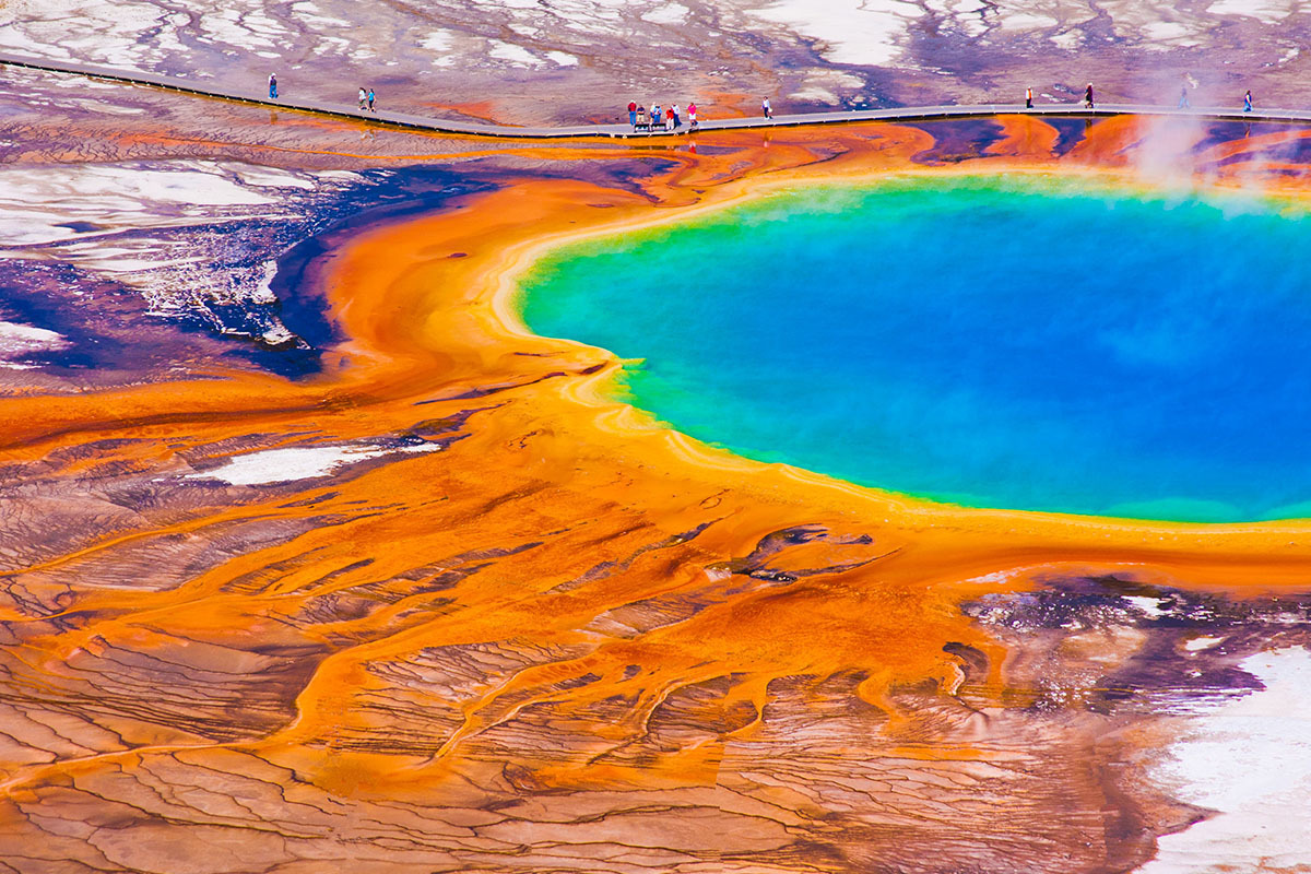
Meanwhile, Yellowstone is bringing us this soothing neutral color palette, which is perfectly coordinated and would be great for every space from the living room to the kitchen.
Grand Teton’s stunning display of blues, purples, and pinks is cool and calming, making it ideal for the bedroom.
Glacier National Park’s colorful little rocks result in a vaguely retro color palette that lends itself well to mid-century modern looks.
The NPS also showcased color palettes from Joshua Tree, Bryce Canyon, Denali, and more, offering boundless inspiration for seasonal updates.
National parks are sporting hues of the season. What are some of your favorite park palettes?
— National Park Service (@NatlParkService) September 16, 2020
Follow #NPSColorForecasting for more!#NPSFW #NYFW #FindYourPark pic.twitter.com/7n7oqA6dpV
Even if none of these color palettes appeal to your personal aesthetic, they offer stellar inspiration for anyone who’s stuck in a design rut. If you snap a photo of any nature scene, then you’ll instantly have a coordinated color palette from which to build a design.